“Pictures (exist) in nature, but only an artist, sensitive to natural harmonies, could identify them”
Time is intrinsic to photography. Every photograph was taken at a specific time and each exposure lasts for the specific duration of its creation.
Earliest photos exposure times would take seven minutes to be done.
Timing is one of the creative elements of a photograph mentioned in Project 1.
Henri Cartier-Bresson famously talked about the ‘decisive moment.’
Timing is of the essence in the creation of most photographs. Photographs can also be used to demonstrate movements and motions through time, motion can be photographed in many ways, or at least implied through photography.
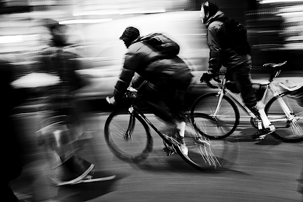
This pieces shows movement through the two human figures walking on the stairs that are blurred indicating that they are moving. The stairs and background are nearly visible and not blurry,d however the two black figures are blurred to indicate fast moving figures.
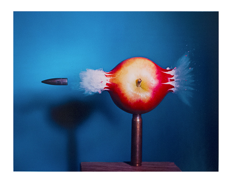
This image perfectly captivates the exam moment the apple was impacted by the bullet, you can see pieces of the apple coming off the apple and being teared, and the juices exploding out of the apple, because of the perfect timing that the image was captured. This images shows movement of the bullet going through the apple and out the other side.
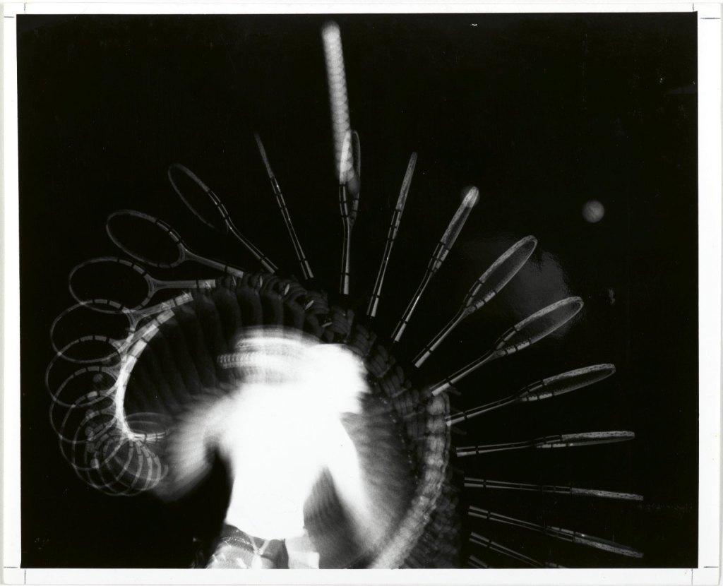
This image shows clear movement of a tennis racket serving a tennis ball in the air. I’m assuming the way this photo was taken was they had the model perform the movement of serving the tennis ball and then proceed to take a burst of images as he does so, then merging all the images together to create this piece, but that’s only a hunch. The image reminds me of stop motion of how we can see each movement he did in order to serve the ball.
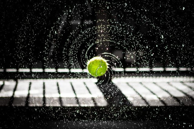
This seems to be done in a similar way as the Tennis Serve piece by Edgerton. Several images were taken which then once merged together shows movement of ballet dancers dancing.
Appropriation: Selecting from the flood rather then taking photos yourself
Story Telling: Photos that tell stories “People are hungry for the story”
I use photography on my social media, either to capture fun moments with my friends and pretty photos of myself, or to take photos of my work because if my work field social media is very important and very good to have to use as a sort of portfolio for your clients.
I believe social media can to an extent devalue photography, because so many people nowadays can claim to be photographers just because they are able to take photos using their cellphones.
However, at the same time it has brought more value and has made photography more widespread, because more people can now admire a professional photographers work and they can find more jobs that way.
I went through my mom’s photo albums and found some old photos that I thought were very nice. One was of my godparents when they were young and in love, the image I find very pretty because it is in black and white is has a filter effect over it that makes it looks like it’s several images merged together which makes it looks very unique and interesting. The image was taken at night and the lights really stand out, the image looks very romantic and sweet.
Below are a few photos of what my neighbourhood and area looks like around this time of year.
OLYMPUS DIGITAL CAMERAOLYMPUS DIGITAL CAMERAOLYMPUS DIGITAL CAMERA
Below are a few photographs that I have taken that centre more around my preferred art form; makeup/cosmetics. The photos include makeup and are portrait photos. I would’ve uploaded more landscape photos, however I wouldn’t upload because I had used photoshop on the files which cause them to not work on this platform.
OLYMPUS DIGITAL CAMERAOLYMPUS DIGITAL CAMERAOLYMPUS DIGITAL CAMERA
I very much enjoyed doing this exercise because I was able to look through many old photos, and take several drips down memory lane, as I looked back on my past creations and past photos I had taken and done.
I agree with John A. Walker’s statement on how an image meaning and context can completely alter depending on the environment and depending on where it’s placed.
Photography is a unique art because there are so many forms of it, and different photographers all take different types of images and all create different meanings and composition pieces. Photography has several layers in it especially for portrait photography. Photo editing software also makes photos wildly more interesting and exciting because you can merge photos, add new layers, etc. As well as the photos can capture the exact moments of things happening (the first steps of your child can be captured for life, or someone’s wedding can be captured the exact moment the couple kiss).
Photographs are always in the present- they are captured not synthesised (to make it or develop it over time).
What is a Photographic Image? A product or confluence of three components as captured within a frame. The three components are subject, content and form.
Subject: what the image is about (theme)
Content: what can be identified/is in the mage (people, items, places, etc.)
When the subject and content are understood the photographer can start to form meanings in their pieces.
Form: The organisational structure of the image, how the photo was taken and composed to convey the subject and show the content.
These three components are crucial to creating a perfect complete photo piece.
Photographs don’t have to have hard copies in order for people to see them or appreciate them, they can just be seen on a camera or printed onto any electronic device. Depending on the electronic device you are looking at the image through the quality has to be lessened so it is able to be seen on it if it’s a low quality device.
Personally I always try to look at images and figure out the how they were taken, and where, I love photography and always try to think about how many images were taken, whether they were staged or real etc.
Mechanical Photography: Photos that are representations of facts or informations.
Creative Photograpyh: All other types of photography; landscape, portrait, etc.
I believe photography can be both mechanical and creative, it depends on who’s taking the photos, and why. I believe there’s a lot more creative photography now then there was in previous centuries.
From 1902, New York gallery owner, and Alfred Stieglitz stated that photography should become it’s own unique medium.
Photography as Genre:
“Photography can never grow up if it imitates some other medium. I has to walk alone; it has to be itself” -Berenice Abbott
Abbott is making a plea for photography to be regarded as an art form in its own right, rather than an adjunct to other genres like painting.
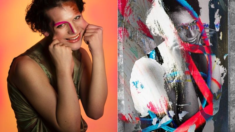
There are millions of paintings, photographs, comic designs, etc. that have been re-appropriated for millions of reasons. Appropriation of images is a common thing in art, because artists will learn by copying other art pieces, or by using similar styles in order to strengthen their skills. Many artists will also take famous paintings and re-appropriate them for commercial use, however for the example that will be explored that is not the case. In this case instead of looking at a famous painting that was appropriated, it is a photograph that has been altered and re-appropriated for other use, as well as the original photographer was never credited for creating the original piece. The left is the original (done by Arabelle Sicardi, and Tayler Smith), and the right is the re-appropriated version (done by Zak Arctander).
The denotations of this piece are that it’s a photo of a transgender actress and model, Hari Nef, (Hellyer, 2015) pulling her cheeks apart, as well as smiling. Hari Nef also appears to be wearing abstract high-fashion makeup. This photo, and photo series could have many meanings, an example is it could be a sort of emotional photo piece, as it might seem that Nef is pulling her own cheeks to make herself seem happier then she actually is. It could also just simply be a makeup appreciation series, showing different makeup styles and then explaining how they are done as Sicardi states “I’m gonna guide you through the portraits…and how to get the looks if you so desire,” in the introductory description (Sicardi, 2014). The photograph was actually done for New York’s American Two Shot(Cascone, 2015), in a 2014 exhibition called “Most Important Ugly.” It was a series originally done by Arabelle Sicardi and Tayler Smith (Julianne Escobedo Shepherd, 2015).Arabelle Sicardi came up with the idea to create these pieces because originally she created a questionnaire for Sephora called “Therapy Sessions” and after seeing the success of it she decided to expand the idea for an art show, so people part of the LGBTQ+ community or those considered “outcasts” were able to tell their stories. Each person that was photographed goes through an interview and is asked many questions about identity, shame, anxiety, and their history with makeup. The photos are of several people like Hari Nef telling their stories, in a biography at the bottom of each image (Sicardi, 2014).The photo series was only shown at an art show in New York, so the photos cannot be seen in person anymore, however they can be found online on the autostraddle.com website where Sicardi and Smith originally published them. Sicardi and Smith wanted to create this series to bring more awareness in society of different characters and people in the world who have suffered, survived, and dealt with many problems that not all average human beings could understand. They wanted to open the minds of their audience and many others with this show.
A year after the photo series had been created in 2014, a recent Yale graduate of 2015, Zak Arctander, took one of the photographs and altered the image for his own use, as can be seen above. He took the photo of Hari Nef, and used it as an art piece displayed at the Danzinger Gallery in “Lovely Dark: Yale MFA Photo 2015” and also “Regen Projects” later that same summer (Cascone, 2015).Arctander took the photo and converted it to black and white. He also partially obscured the portrait with graffiti and made it a 60 x 36 inch vinyl print (Casone, 2015). He renamed the piece from simply being called the name of the model “Hari Nef” to “Cheeks.” (Hellyer, 2015). By the name,Artander is most likely referring to the way Hari Nef is holding her cheeks, and pulling them apart,however, if there were a deeper meaning, it is still to this day unknown. After Zak Arctander’s gallery piece “Cheeks” was seen it was published in the next issue of the New Yorker under the panel “Freedom of Young Photographers” and credited towards him and not the two original women (Sicardi and Smith, 2015).It was an article to show how photography was expanding and growing into multiple new forms and ideas. The writer took many other Yale Graduate art pieces and used them as examples to show how creative photography is getting in his article as well (Als, 2015). The two original artists stated that Arctander’s work was lazy, bad, and “replicates the very ideology that the original photo pushed against.” (Sicardi, Smith, 2015) They attempted to reach out to Arctander to find an explanation behind what he had done, however after having his work slandered by these two artists, it can be understood as to why he didn’t reply. (Shepherd, 2015). Arctander was never sued or prosecuted for theft or plagiarism, because James Danziger (the proprietor) stated that because of the way Arctander changed the piece it is counted as “legitimate appropriation and transformative use.”(Cascone, 2015).
The two photographs both have different meanings. Although the real meaning to the second image is unknown, it can be understood that it does not have the same meaning as the original and took on its own meaning once it was made. However, it could be interpreted as they are both pieces that are trying to open people’s mind to new ways of thinking just in different things i.e. the original is opening people’s mind about different people in the world, the re-appropriated piece opening people’s minds about new ways of photography. The two pieces, once analysed, don’t look too similar, although once they are put side by side it becomes clear that they were once one in the same. The similarities that seem to be more represented in these two pieces, seem to be Hari Nef’s facial features which are still visible in both, the rest of Hari Nef’s body can also be seen but because a lot of it is covered by graffiti or in black and white, the face seems to stand out more.The original photo by Sicardi and Smith was more created for the sake of telling people’s stories so the image is relatively simple, however Arctander’s version of the piece is a lot more experimental in the sense that he uses different elements in the piece and not just taking the photo for what it is. He added randomly placed colourful graffiti into it, and by making it black and white made the graffiti stand out and be more eye-catching.
The two pieces were made several years ago however this seem to be very important and still speak to the artistic and societal struggles of modern society. The original still is relevant to this day because there are still many people in the world who would shame people like Hari Nef, and there are many artists like Sicardi and Smith who have not been credited for work they have done.
“Nothing is so sad, in my opinion, as the devastation wrought by age. My poor friend. I have described him many times. Now to convey to you the difference. Crippled with arthritis, he propelled himself about in a wheelchair. His once plump frame had fallen in. He was a thin little man now. His face was lined and wrinkled. His moustache and hair, and hair, it is true, were still of a jet black colour, but candidly, though I would not for the world have hurt his feelings by saying so to him, this was a mistake. There comes a moment when hair dye is only too painfully obvious. There had been a time when I had been surprised to learn that the blackness of Poirot’s hair came out of a bottle. But now the theatricality was apparent and merely created the impression that he wore a wig and had adorned his upper lip to amuse children!” (Curtain, 1975)
Agatha Christie is both a contemporary and a non-contemporary author, as she wrote both before World War II and after. She was most famous for her book series that followed a detective by the name of Hercule Poirot. The passage above is from her novel ‘Curtain’ which is the last Poirot novel written by Agatha Christie and ends with his death. ‘Curtain’ was published in 1975, and this specific passage is 157 words long, and appears to be a eulogy spoken by Arthur Hastings (Poirot’s colleague) at Poirot’s funeral. The passage above from ‘Curtain’ pulls in several themes, uses language techniques, as well as with it’s anecdotal evidence pulls in the reader and makes them feeling like they are right at the funeral themselves.
To begin with, in Agatha Christie’s novel ‘Curtain,’ Poirot investigates his last case and then dies at the end of the book. This passage above shows Hastings reading the eulogy he made for Poirot at his funeral. The themes death and time are strongly represented in this passage. “Crippled with arthritis, he propelled himself about in a wheelchair,” the reader learns that Poirot died of arthritis, and saying that he was restrained to a wheelchair, can be interpreted that Poirot suffered a long battle with this disease. The description of his state shows that his disease was very difficult to deal with, and that he had to deal with it for a very long time. The novel is called ‘Curtain’ which can be seen as theatrical and almost symbolic of a curtain closing at the end of a play, like the curtains closing at the end of Poirot’s life, and at the end of the fictional book series. This symbolism of curtains represents the theme death. Christie wrote her final novels of the Poirot series in the 1940’s during WWII, and locked them in a vault, as she feared for her life, and didn’t want to die knowing that her novel series didn’t have an ending. Christie however survived the war, but kept the books still locked away finding the perfect time to publish them. She shows the importance of time and place as she almost strategically published her novel, ending her famous fiction character Poirot’s life, only a year before the end of her own life. The timing was very important because she was able to gives all her readers closure on their favourite novel series, and still have a small amount of time in her life to enjoy it.
Christie’s writing in this passage reminisces on how Poirot was in his last few months before death. The passage is pure description with visible language techniques used. She creates very strong imagery with the way she describes how Poirot was. “His once plump frame had fallen in. He was a thin little man now. His face lined with wrinkles” this description has strong signs of imagery, and gives a grime visual of Poirot in his last moments of life, old and fading, creating an image to the reader of how much his arthritis effected him, and deteriorated him. The author uses the words “once plump frame,” which can show that Poirot once seemed indestructible and ageless, but had now been reduced to a wheelchair, and was left as a thin little man with wrinkles who probably had grave difficulty doing simple daily tasks. As stated before with ‘Curtain’ being the title of the book, it could be seen as a form of foreshadowing towards what could happen at the end of the book; the curtain closing on Poirot’s life. The colleague reading the eulogy also talks about how towards Poirot’s end he still dyed his hair that same shade of jet black, however now it was “only too painfully obvious,” which can show that perhaps Poirot tried to compensate for his now thin frame by dying his hair to make him still look young and youthful, as if he wasn’t ready to go. The way the description is done it makes the reader able to reminisce and also sympathies with Poirot, as if they personally knew him and could understand the painfully obvious hair dye.
Above all, Christie purposely tried to make this passage as meaningful and touching as possible, so the reader can remember Poirot just like the characters did. Hastings starts by saying “my poor friend,” showing that him and Poirot did have a close relationship beyond simply partners who worked together. Although it was a small statement it shows meaning with how Hastings felt sorry for Poirot having the suffer the way he did with his arthritis, and as a reader you can see how touching this statement could be. Hastings talks about how Poirot, even in his old age, still dyed his hair and moustache black. “I would not for the world have hurt his feelings by saying so to him, this was a mistake,” Hastings jokingly says this to almost lighten the mood during the funeral, and show how close him and Poirot were, and although they were good friends he wouldn’t want to upset him like that. Hastings being able to joke about Poirot’s hair now and add the anecdotal story can show how much value was in their partnership, as well as can make the reader feel a lot more connected to Poirot because they are able to laugh about his jet black hair too. Hasting continues to joke by comparing Poirot’s hair to a wig, and his moustache as a theatrical way to amuse children, this funny anecdote that Christie added in gives the reader the ability to have a personal connection to Poirot as Hastings was, because they can also laugh at the small jokes that are being made towards the him, even though they are meant to be harmless. These last sentences in Hastings eulogy are the most personal, because Hastings refers to something about Poirot that all the funeral goers and the readers can understand and wasn’t something linked to his disease, creating a more personal atmosphere and bringing meaning to the readers.
The book series that centred around Hercule Poirot by Agatha Christie is still very famous to this day. This passage above was a eulogy done by Hercule Poirot’s good friend Hastings, and it sums up Poirot in his final moments and his most famous features perfectly. Agatha Christie was able to publish her final book of this novel series in perfect timing before her death, and was able to give all her fans the closure they needed on the book series. The way Agatha Christie finished the book with Poirot’s death and being able to connect the readers so closely to him at his funeral was a brilliant ending to her literature career.
Jeremy Deller’s “Battle of Orgreave” was made in 2001, and was meant to be a reenactment of the original battle in 1984 that happened during the miner’s strike in Yorkshire. The Battle of Orgreave was part of a protest done by miners in Yorkshire to shutdown the British coal industry, and is known as a major industrial action. Deller is an English conceptual, video, and installation artist who’s done other pieces that are also as impactful as his Battle of Orgreave, and typically represent a historical or political event that has happened. Jeremy Deller’s Battle of Orgreave can be interpreted in many ways and the importance of time for his piece can be seen throughout, as well as how powerful it was to be redone and how accurate it was to see.
The original Battle of Orgreave, and the reenactment had an impact and effect on people in the town, but for different reasons. The original had a traumatically divisive effect at all levels of life in the UK, as well as tore families apart because of the divided loyalty (Deller, 2002: foreword). For the reenactment, many of the people who took part were actually former miners, and a few former policemen who were reliving the events that they themselves took part in, which can be very impactful. (Deller, 2002: foreword). The Jeremy Deller “Battle of Orgreave” was done so perfectly well it was described more as a piece of social history “re-lived not re-enacted” (Artangel, s.d.). The piece is amazingly accurate because of Deller’s commitment to make everything exactly the same as it was in 1984 (Jones, 2001). The reenactment piece was made to commemorate all the people that suffered from the mines in 1984, and bring back awareness to the cause, because during this Battle many miners suffered severe police brutality where not one officer of the 90 who were prosecuted were convicted (Jones, 2001). Deller made this piece to remind the world of what the miners in 1984 went through, and to let the people from the town the Battle of Orgreave took place in, who suffered, know that they’re still important and supported.
The importance of time and place in Deller’s reenactment piece “Battle of Orgreave” is visible both in the events that occurred before the installation was created, when it was being acted out. The day when the battle reenactment occurred it was said that it unfolded with military precision but came across as though it was real (Artangel, s.d.) Jeremy Deller was 18 years old when he first saw The Battle of Orgreave on the news in his home in 1984, and instantly he was shocked by it and wanted to recreate it as soon as he could (Deller, 2001). At the age of 18 Jeremy Deller was a young adult and could completely understand the importance of the battle that had occurred, and the want to recreate it. Deller started making this piece in 1998 with Artangel, however it wasn’t executed until 2001, this piece took so much time to create because Deller wanted every little detail to be exactly like the original battle “all the way down to the miners’ vintage 1980’s T-shirts” (Jones, 2001). He spent months researching the events that took place on June 18th 1984 “court testimonies, oral accounts, film footage, etc.” (Farquharon, 2001) all to make sure everything was as accurate as possible. Deller spent all his time making sure that there was no associated paraphernalia in the piece that wasn’t meant to be there. He shows the importance of time by how much time he spent trying perfect all parts of the reenactment to make it flourish, as well as the important of time by how he perfectly set up the reenactment so it was laid out exactly like it was during the original battle.
Jeremy Deller created the “Battle of Orgreave” in 2001, since then and before he’s created many other pieces, many in the same style as the Battle of Orgreave. Most of his pieces have some sort of political or social importance in them, that make them more interesting. Jeremy Deller’s 2016 piece “We’re Here Because We’re Here” was done to stand up for the soldiers who lost their lives on the first day in the Battle of the Somme that had been forgotten about by most people (Mehrez, 2017). These two pieces although represent vastly different events, both were very severe, seeing as the Battle of Orgreave was described as a war scene rather then a labour dispute (Deller, 2001). Much like the “Battle of Orgreave”, “We’re Here Because We’re Here” was also done in remembrance of the events that took place at that time and showing to the families of those lost soldiers and miners that they haven’t been forgotten about and didn’t fight for nothing. Another example are the two art creations; “The History of the World” (1997) and “Acid Brass”(1998) (which was made as an expansion off of “The History of the World”). “The History of the World” is a graphic, and textual portrayal of the history, influence, and context for acid house, and brass band music (Wilson, 2009). It is a flow diagram that shows that there are confluences between the two musical movements (Wilson, 2009). “Acid Brass” was made a year after “The History of the World” as a musical continuation piece based on the connections Deller had many in the previous piece (Deller, 1997). In the diagram of “The History of the World” on the acid house side, Deller makes points to Castlemorton (a free rave) which was a festival that had such a huge effect on people it changed a law, just like how the Battle of Orgreave (which had connections to Brass Band) changed a law as well. These two pieces are seen as a direct overture to “The Battle of Orgreave” made in 2001 (Wilson, 2009).
The Battle of Orgreave by Jeremy Deller is a piece full of historical accuracy, and was created to speak up for the miners who suffered and to bring awareness to this unruly battle that occurred. Jeremy Deller had wanted to recreate that piece since he was 18 years old, and when he finally was able to in 2001, after three years of planning and research, he made sure everything was incredibly accurate and it all stood out to every person who saw, including the people who weren’t apart of the battle set up.
Developments in social and new media have created a world in which we’re all more connected.
Since 1995 groups of pioneers (visual communicators, scientists, etc.) have explored work relevant to the time and place surrounding us, some of which has involved online experiments.
There are millions and millions of different types of websites that show a full wide range and here are a few examples:
Kahoot is a website which is very common in classrooms where students have class computers or iPads or any sort of electronic device. It is a website where you can create millions of types of quizzes as a student or as a teacher, as well as being able to play quizzes. It is a modern way to play quizzes and really helps student get involved in their work and up their grades by doing online quizzes as games to revise for example.
Showbie is another school website, that is both a website and an app you can have on your phones or iPads. It is a much easier way to store papers and assignments for both students and teachers. This way students have less papers to carry and can easily submit their essays or any assignments easily online instead of having to carry around a lot of papers that can get lost.
Poptropica is a gaming website, where the entire website is about this game called Poptropica. It was a game a constantly played as a child and was one of my favourites even though it was very difficult. The game is very educational but also incredibly fun, and it was a very genius idea to have simply one website which has one game and in this game there is a whole world that you have to rescue by doing all this mini island quests. The game is entirely free and as a child is a lot of fun.