The Global Village

In 1964 Marshall McLuhan established the idea of a media ‘global village’ to describe the way in which electric communications has made us feel we’re all connected, irrespective of distance, time or location.

Interconnectedness has become more known with the development of the world-wide web, mobile technologies, and the integration of other forms of mass media.

The idea of single global village has both its opportunities and its problem for visual communicators. Although more people can access the same information in the same way, those people now come from a much broader rand of social ,cultural, and linguistic backgrounds. Meaning visual communicators need to adapt their approach to specific audiences or find ways to create internationally recognisable messages.

The development of social media allows us to be involved in creating content for others to engage with, and engage with it ourselves. The involvement has democratised access to mass communication, allowing all of us to have a say.

Many of the ‘traditional’ visual communication industries (publishing, advertising, and newspapers) have struggled to adapt to new ways of working.

The space created by electronic communication i.e. internet, games and other digital technologies also represents a contradiction between our presence and non-presence in the world.

Cyberspace changes the rules for both time and place. It allows us to reconstruct our identities in new ways, allows for social interaction that bridges geographical distance and offers new kinds of spaces to interact within.

Visual Conventions for Time and Place

Hergé is a comic book artist he is the creator of The Adventures of Tintin which is a very strong example of visual conventions. “The Adventures of Tintin” is one of the most famous comic book series in Europe in the 20th century.

Many comic book artists use visual conventions in their comic books, because comics are usually frame-by-frame storytelling.

This is an example of Hergé’s comic series
https://icelandmonitor.mbl.is/news/news/2019/09/12/plans_for_tintin_statue_in_akureyri/

This is an example of Hergé’s work and as you can see he works with a lot of visual conventions as many order comic artists do. He works with different angles of the same scene, and works with movement and shows a lot of time and place.

You can see visual conventions in a mural artist Denton Burrows’s work as well. He is a artistic entrepreneur and extremely passionate about public art. His murals are a way to of dealing with the world around him as a form of therapy.

An example of his work
https://www.frontrunnermagazine.com/denton-burrows/

You can see in Denton Burrows’s work has a lot of movement in it and uses space very nicely, and shows a sequence of frames where you see the fist slowly punch through the face, creating a new perspective everywhere you look

Representing Time and Place

How are our experiences of time and place represented visually?

Comics, animations or moving image present a narrative that plays out frame by frame over time, using a sequence of images to cut from one view to another and identify points in time.

Literary devices (dialogue, descriptions, third person narration, or written sounds) are combined with the frames.

Single frame images can also work to present a visual story by structuring the visual information so we read it in a particular order.

An example
https://iso.500px.com/tutorial-how-to-shoot-sports-sequences-like-a-pro/

What distinguishes one visual narrative from another is their use of composition, framing, and structuring. Changing the way and image is framed can radically change how it’s read.

In cinema we are used to things in square, maybe because we generally like the view with our eyes parallel to the horizon. Tilted angles and rooms take a different or more dramatic meaning.

Viewers become more accustomed to visual conventions that present the world in a particular way.

e.g. We expect illustrative representations to conform to the rules of perspective, so that things generally look similar to how we perceive theme in the world.

The Cubists’ still life paintings tried to show objects from every angle, not just a single viewpoint.

The idea of realistic visual representation in one convention amongst many other approaches that contemporary visual communicators draw upon.

Knitting Patterns

Knitting is a method by which yarn is manipulated to create a textile or fabric, often used in many types of garments.

https://en.wikipedia.org/wiki/Knitting

Messy Mind Map on what I think of when I think about knitting:

Historical Knitting:

Historical gown that was knitted
Another example of historical times knitting https://mathomhouse.typepad.com/bluestocking/historical-knitting/

In historical times it seems that knitting was used to make warm gloves, or dresses or cardigans for women to wear. Knitting was done by women and usually worn only by women in the historical times as well as the knitting methods were all very similar and tight knit.

Woman wearing knitted sweater in contemporary times http://movedbybreath.com/creativearts/project-4-exercise-2-knitting-patterns/
Man wearing a knitted sweater in contemporary times
https://www.amazon.co.uk/Men-Knits-Sweaters-knit-that/dp/1931499233

In contemporary times knitting is usually done for big comfy sweaters, scarves, or such warm clothing like that and both men and women are known for wearing them. In contemporary times it seems that the stitching in the knitting is bigger and has more visible patterns then in historical times.

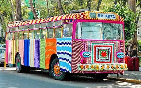
Magda Sayeg was the founder of “Knitta Please” which is a group of artists who began the “yarn bombing” movement in Houston Texas in 2005. They are known for wrapping public architecture with knitted or crocheted material. Their goal was to make street art “a little more warm and fuzzy.” 

https://en.wikipedia.org/wiki/Knitta_Please

What is “yarn bombing”?

Yarn bombing is a type of graffiti or street art that employs colourful displays of knitted or crocheted yarn or fibre rather than paint or chalk.

https://en.wikipedia.org/wiki/Yarn_bombing

Yarn bombing example on trees in a park in Europe. https://www.daysoftheyear.com/days/yarn-bombing-day/
Yarn bombing done by Magda Sayeg
on a bus in Mexico.
https://www.telegraph.co.uk/news/uknews/4305406/Knitters-turn
-to-graffiti-artists-with-yarnbombing.html

After doing a bit of research on knitting and understanding what contemporary knitting is more about, I find it a lot more interesting and see that is has developed a lot more then what I originally thought. The stereotypes of knitting are very similar to what I thought about, where its just your grandma sending you winter knitted gloves for the cold season, and the knitting just for old grandmas etc. However now I can see that there is a whole movement centred around it now and it has grown a lot more in the new centuries and throughout contemporary times and I’m sure will continue to grow.

Reusing the Old

It’s difficult to predict the future, and the need to remain constantly in the present is a strain, especially when there’s a wealth of historical material that can be recycled and reinvented.

Retro designs, in one way or another, are almost always in fashion.

The re-emergence of old technology such as the letterpress, screen printing, and Kodak-style photography, show the influence the pas has on the contemporary visual culture.

Example of Kodak-style Photography

https://www.format.com/magazine/resources/photography/how-to-develop-film-35mm-120

Many trends that seem to be completely new have roots in much earlier ideas, and designs. The past will always maintain an influence on the present, but over-reliance on these well-used signs can erode them to the point of cliché.

Fanny Packs being Trendy in the 90’s
Fanny Packs Trendy in 2019

https://fashionista.com/2018/06/london-fashion-week-mens-spring-2019-street-style

Fanny packs are a perfect example of this, they were once trendy in the 1990’s but fell out of trend and now have been making a comeback in street style, but are worn differently then they were in the 90’s.

Fanny Packs are now a very common and trendy item amongst young people, and can be worn in everyday street way but is also used in a practical sense during music festivals or order to keep your valuable closer to you and less likely to be stolen.

Many visual communicators draw on the semiotic power of well-known images to make their messages more recognisable, or draw on the ideas of the original to put forward a counter argument.

Why fix something that isn’t broken?

The 1914 wartime recruitment poster of Lord Kitchener declaring “Your country needs you” has been reused by other countries in other conflicts and by campaigners i.e. “You hospital needs you”

Shepard Fairy did a similar thing for Obama’s 2008 campaigning “Hope” poster. The “Hope” poster has in turn been re-appropriated by protest groups to draw attention to other political issues.

The Next Big Thing

Example of contemporary visual communications:

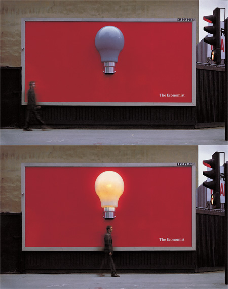
Advertisements for “The Economist”

http://s-lane1114-dc.blogspot.com/2012/01/context-of-practise-5-examples-of.html

It is a very new form of advertisements because it is 3D as well as sensor activated so when a person walks under it the light turns on. The 3D aspect and sensor are both two very new contemporary trends.

It is not visible whether there are any of historical influences.

The idea of 3D advertising might very well become “last year’s thing” if there becoming more development into the 3D realm that makes this advertisement look dated. As well as the sensor activated aspected could be seen as less exciting as advertisers ways to activate other seniors or etc.

I am not sure what could replace this advertisement but it would most likely be something a lot more high-tech.

Time and Place

The here and now drives many aspects of visual communications, along with much contemporary culture.

This newness might manifest itself as a change of style, a new fashion, or more radically through changes in how communications take place and our social expectation of them.

Many visual communicators operate on the cutting edge of visual culture and embrace new ideas and the latest look as quickly as they abandon the old ones.

I.e. A website can appear new through aesthetic changes made by a designer whilst maintaining the same underlining structure.

Or old ideas (old media) may evolve with the modern times, e.g. online newspapers instead of paper ones.

In the future

Visual communicators whose work has a strong relationship tho fashion or technological developments are very much concerned with predicting and shaping the future path of visual communications.

Always keep an eye on what’s behind the corner.

From a business perspective, it makes good sense to be seen as an early adopter; however there’s no guarantee of the take-up or success of anything untried or untested.

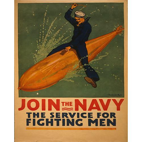
Join the Navy Poster

Denotation: You can see a man from the navy riding a torpedo in the water, and seems to be enjoying it, almost as if he’s riding a bull.

Connotation: There could be many meanings Babcock was intending on, for example in order to recruit people to join the navy he made the man in the poster look like he is having fun, so recruits might find the navy more exciting.

Red neck tie over knob of white wooden door.

This is another example the classic “tie on the doorknob”

Denotation: it is a tie tied on a doorknob

Connotation: usually in college dorms or roommate housing a tie on a doorknob means that no one should enter because the two people in the room are having intercourse.

Denotations and Connotations

Semiotic analysis uses the idea of denotation and connotation to describe literal and implied meanings within the visual.

Denotation describes what can be seen and its literal interpretation (e.g. a piece of fruit called and apple).

Connotation describes the possible meanings that are suggested by the literal elements (e.g. in a Renaissance painting, an apple might symbolise temptation).

Example: the ‘saucy’ seaside postcards pioneered by Bamforth Postcards in the early 1900s.

What does this Apple mean?

By looking at some artistic painting and comparing it to the apples you see in TV adverts you can see that there is a difference between them.

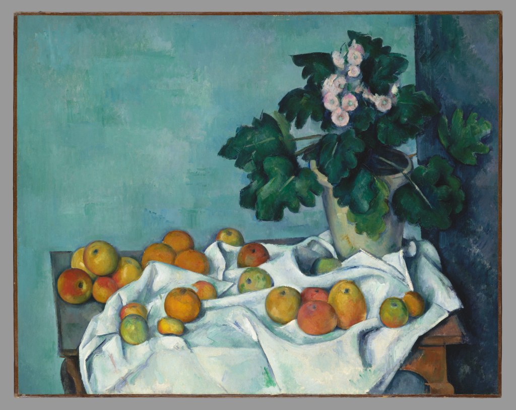
The apples in paintings seem to be more realistic and revealing to all the different types of apples, including those with bruises and with different colours etc. Artists tend to show the truth in heir art and don’t try to hide the scars and secrets that’s why the apples in painting seem to be less “perfect” or less commercially viable.

Apples and Cakes (Pommes et gateaux) by Paul Cezanne, 1873-1877.

http://arthistorynewsreport.blogspot.com/2014/11/the-world-is-apple-still-lifes-of-paul.html

https://www.metmuseum.org/toah/works-of-art/51.112.1/

Whilst the apples in TV adverts or movies for the most part are ripe bright red apples that are the most appealing to customers, whilst they barely show ones that are completely green, or different shades of orange because for the most part they are less appealing then the bright red ones.

http://www.foodanddrinkbusiness.com.au/news/coles-caught-up-in-fresh-controversy

https://www.bloomberg.com/news/articles/2018-11-08/the-curse-of-the-honeycrisp-apple

Design a site like this with WordPress.com
Get started